


I have been working with a few clients both local and via e-design and wanted to share with you all about what I am doing on these projects. I have enjoyed working and creating spaces I know my clients are going to enjoy for a long time.
Today I am giving you just a little peek into one of my local client projects. Donna contacted me about a month ago for a paint consultation for both her front living room and large family room. She wanted to brighten up both spaces and create a more relax feel.{sorry for the quality of my phone pictures! That's all I had with me}
Family Room Before:


Living Room Before:


As you can see both rooms have fantastic features and pieces. They both just needed a little paint and some accessorizing. That's the fun part!
My clients really fell in love with Restoration Hardware's line of paint colors for the family room. I originally recommended either Glacier or Silver Sage. I thought both colors were great neutrals but would give a bit of a relaxed feel to the space and allow them to choose punches of color in accessories. I left my samples with the family to decide. They called and decided that they wanted more of an impact and to really make a statement on the walls.

They decided on Light Silver Sage. I am so glad they did. It really feels like a soothing room that you want to escape to. They have large windows that look out onto their hardscape and pool area. This blue/green/gray really reflects some of the colors just outside their windows. I also love how the color changes throughout the day. It really is gorgeous in person!

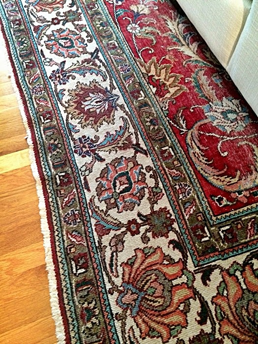
The color on the wall really pulls out the colors in the rug as well. This room is starting to come to life!
Now onto the front living room. I shared the picture below with my clients and they automatically fell in love with the idea of adding a pop of color to the built-ins rather than painting all of the walls.

The paint on the back of the shelves is Wythe Blue by Benjamin Moore. When I shared the sample with them, they thought it might be a bit too dark for the space. So they decided on the color above Wythe Blue called Chesapeake Blue.

Boy did that color make an impact in that small space!

Now we are on to finding some lamps, pillows, throws, artwork and of course tackling the built-ins with some stylish accessories. Stay Tuned! Can't wait to share more progress.
And I couldn't leave you without a couple Before & Progress Pictures...


Such a big difference the change of colors made! I love the colors!
ReplyDeleteAmy,
ReplyDeleteI love the give and take with your clients. You have made such powerful changes with paint. I can't wait to see more.
Karen Marie
Dragonfly & Lily Pads
I found your blog by way of Pretty Handy Girl Instagram