Thursday, July 31, 2014

Client Project Update {The power of paint}

Hi All! Hope you are having a great week. I am so ready for Friday...how about you?

I have been working with a few clients both local and via e-design and wanted to share with you all about what I am doing on these projects. I have enjoyed working and creating spaces I know my clients are going to enjoy for a long time.

Today I am giving you just a little peek into one of my local client projects. Donna contacted me about a month ago for a paint consultation for both her front living room and large family room. She wanted to brighten up both spaces and create a more relax feel.{sorry for the quality of my phone pictures! That's all I had with me}

Family Room Before:


Living Room Before:


As you can see both rooms have fantastic features and pieces. They both just needed a little paint and some accessorizing. That's the fun part!

My clients really fell in love with Restoration Hardware's line of paint colors for the family room. I originally recommended either Glacier or Silver Sage. I thought both colors were great neutrals but would give a bit of a relaxed feel to the space and allow them to choose punches of color in accessories. I left my samples with the family to decide. They called and decided that they wanted more of an impact and to really make a statement on the walls.


They decided on Light Silver Sage. I am so glad they did. It really feels like a soothing room that you want to escape to. They have large windows that look out onto their hardscape and pool area. This blue/green/gray really reflects some of the colors just outside their windows. I also love how the color changes throughout the day. It really is gorgeous in person!


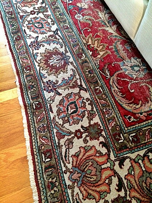
The color on the wall really pulls out the colors in the rug as well. This room is starting to come to life!


Now onto the front living room. I shared the picture below with my clients and they automatically fell in love with the idea of adding a pop of color to the built-ins rather than painting all of the walls.


The paint on the back of the shelves is Wythe Blue by Benjamin Moore. When I shared the sample with them, they thought it might be a bit too dark for the space. So they decided on the color above Wythe Blue called Chesapeake Blue.


Boy did that color make an impact in that small space!


Now we are on to finding some lamps, pillows, throws, artwork and of course tackling the built-ins with some stylish accessories. Stay Tuned! Can't wait to share more progress.

And I couldn't leave you without a couple Before & Progress Pictures...


Tuesday, July 29, 2014

Tuesday Treats #20 {My picks from the week}

Another Tuesday is upon us and I can't help but share my wonderful finds from this past week with all of you. So many fabulous new ideas and DIY projects on the web. It is amazing that I get anything done around here.

Enjoy this week's Tuesday Treats....


1. OPI Joins Clark + Kensington
OPI nail colors are now available exclusively in Clark + Kensington paint. I have a couple of favorite nail colors that I would love to make into fun colors for the walls. You can see more options at your local Ace Hardware.


2. Hutch Made into Bar
I love this DIY by my friend Kim at O is for Organize! What a transformation. I would have just looked past this hutch's beauty, but not Kim. Annie Sloan paint, new knobs and fantastic styling is all it took to change this piece. Click on over to see all the details HERE.


3. Paint, fabric & Wall paper samples
Do you ever walk into a store and wish you had a paint sample to match curtains or a fabric sample to match paint? Well I do! I absolutely love this quick and easy idea from My Sweet Savannah. You can see the full tutorial HERE. These little rings would be perfect to carry around or leave in your car for that "just in case" moment.


4. DIY- Easy Abstract Artwork
Emily A. Clark can make anything look amazing...seriously! She needed a little art in the corner of her bedroom and decided to recreate some abstract art inspired by Pottery Barn. How easy can a sharpie and a piece of white paper be!? Love how it turned out.


5. Gray and White country kitchen
There is something about the picture below that I can't get enough of. I am not sure whether it is all the rustic details, the feel of home or just the well designed country kitchen....I just can't get enough. To see more photos of this kitchen, click HERE.


What is your favorite Tuesday Treat from today? Have you found anything fun and exciting around the web that you would like to share with all of us?

Have a wonderful day friends.


Friday, July 25, 2014

Fabulous Feature Friday {Charming in Charlotte}

YAHOO! Happy Friday everyone! I know I am pumped for the weekend, how about you? I am looking forward to spending some time outdoors with my family.

Today's Friday Feature is the lovely Mallory from Charming in Charlotte. She also attended the Haven conference a couple of weeks ago. If you don't follow her blog, hop on over and take a look. She has great ideas for the home as well as fashion posts you won't want to miss.

Enjoy the tour!


How adorable is this nursery? Love the idea of using an old frame around a monogram!

Hope you enjoyed Mallory's home tour. She is the queen of DIY and has completed many projects on her own in each space. Please check out more of her home tour HERE and start following up to date projects HERE.

Have a fabulous Friday my friends!

Wednesday, July 23, 2014

Creating a Meaningful Home

Hi All! Hope you are having a wonderful week! Can you believe it is Hump Day already?

Just wanted to let you know that I am over at SAS Interiors today talking about Creating a Meaningful Home. 


Please stop on over to see how I try to create meaning and purpose in my home as well as say hello to my friend Jenna! She is one talented lady. {Warning: You will want to stay a while!}


Monday, July 21, 2014

Playroom Design Plan & My Go-to {Kid Items} for the Home


Ever since I designed this reader's playroom and this reader's family room , I have received numerous emails about needing ideas on how to organize kids spaces while making them feel cohesive, fun and family friendly.


So today I am sharing a couple of design boards filled with my go-to items for kids. Remember that it doesn't have to be pricey to be fabulous!

A Few Tips:
1. Look for items that have lids or covers to hide toys when company comes over.
2. Find fabric that it easy to clean.
3. Mix and match high-low items so your space doesn't feel like a fisher-price house.
4. Add pops of color and texture to keep children engaged when playing in the space.


Kids Space 1
White Shelves, ABC Art, Pendant Light, Tree Shelf, Teardrop Bean Bag Chair, 123 Bins,
  RugWicker Basket, Tassel Bins


The space above was inspired by the ABC art print. Lots of vibrant colors to pull from! This space could be for any age child. I especially love the bean bag chair that gives that chartreuse pop to the space. 


Kids Space 2

Animal Print Art, Pendant Light, Kids Wicker Chair, Striped Tent, Art Organizer, Supply Cart,
White Dipped Baskets, Campfire, White Cube table, Gray Bins Organizer


The second space is a little more subdued with calming black, white & grays with pops of turquoise and coral. Those animal art prints are hands down my favorite art for kids spaces. There are so many different animals to choose from and the 8x10's are only $25. Can you believe that the kids wicker chair is only $20 at Ikea!? Loving all the organization the bins, cart & art caddy can bring to this space as well. 

So are you convinced that you can have a fun kids space that says fabulous!?

Tell me...what are your go to items for organizing your kid's toys?


Friday, July 18, 2014

Fabulous Feature Friday {Life on Virginia Street}

I am very excited to share today's Friday Feature. Sarah writes the blog Life on Virginia Street. I had the pleasure of meeting her at the Haven Conference last week and she is seriously the sweetest person ever. Not to mention quite talented at decorating her home. Wait till you see her office! Definitely one of my favorites. Oh and the laundry room...don't get me started. I wish I had a laundry "room"!

Enjoy the tour.....


Thank you Sarah for sharing your lovely home with all of us!  I can't wait to see what you have up your sleeve next!

To see more photos go HERE. To see her previous homes: Home Tour 1, Home Tour 2

What did you love most about Sarah's home?

Have a wonderful weekend friends!


Thursday, July 17, 2014

Dining room {Before} & A New Plan

Do you ever sit in one room of your home and then gaze over to the other side of the house and realize it needs a little something? The Hubs always knows when my mind is whirling with ideas because he says my eyeballs move from place to place! I am sure he is thinking "uh oh, there goes more money"! HA!

Well a few weeks ago I was sipping some coffee in the living room and looking into our dining room. I absolutely love our coffered ceiling, the gallery wall and vintage settee, but I knew it needed a little punch and a definite update.

View from entryway

My mother-in law helped me make the red silk drapes when we first moved in 6 years ago. I have really loved the punch of color, but I feel that my design for this space is going a little more on the relaxed side. Besides, the intense NC sun has also created little tears in the fabric. It is time for a change!

View from living room


The walls in this room have never been painted. They are still the original builder beige/yellow that I detest. It has worked for now, but it is time for something without yellow undertones. 


The dining room table was built by my grandfather. I love the history behind it. It has three more leaves that create quite a large table for entertaining. It will stay for now, but I want to add two wing-backed chairs to the ends. The side chairs are from target long ago and still serve their purpose. So they will stay as well. 


Oh how I wish I could recover the settee with an updated fabric, but for now I am just going to add a fun pillow that will give it a pop. The color of the settee fabric blends into the wall color, so want to lighten the walls and really show off her curves.


Here is a little plan that will incorporate items I already have and add just a few touches that won't break the bank!

Dining room revamp
I want to add these West Elm curtains for more of a relaxed playful feel to the space. The settee will get a fun pillow in this fabric. My fiddle leaf fig will get a new decorative basket. And if you read about my Home Decor Wish List last week, you know that I am crushing on these affordable winged-back chairs from World Market. I want to also give them a playful twist by adding a fabric to the back. I am thinking this fabric would be fun.
I am still debating on the rug. I may just leave the hardwoods without a rug for now. The floor is much easier to clean without a rug underneath the table. But I do love this one.
I am also thinking about changing out some of the Paris pictures with photographs I have taken when traveling to Italy & Greece. It would give a bit more color to the walls.

So..that is the plan people! The curtains came in the mail this past week and I just need to raise the curtain rod so I can hang them. I have painted two walls in Shoji White by Sherwin Williams. The paint isn't really white white. It has a bit of a gray undertone to it. It really has a cozy feel when paired with the dark coffered ceiling.

I hope to be able to share a little progress with you all very soon!

What projects are you all working on at home? Do share!


Wednesday, July 16, 2014

Haven Conference {Recap}


Hi All! I am finally rested and rejuvenated from my amazing weekend away. If you are a blogger and have never stepped out of your comfort zone to attend a blogging conference, I highly recommend it. This is my 3rd conference and my second Haven Conference. Conferences are a great way to meet so many talented individuals from around the country while learning new tips and tricks as bloggers and DIYers. If you aren't a blogger, think about different classes in your area that would be fun for you to get involved with. You never know where stepping out of your comfort zone might take you.


The conference was held at the beautiful Crown Plaza just north of downtown Atlanta. It was decorated top to bottom for our arrival. Classes were held throughout the day and cocktail events were held late into the evenings.

There might have been some dancing involved, but some things are best kept secret! hehe


During breaks throughout the day we were able to visit so many wonderful sponsors. They had some adorable booths set up where we had a chance to win a product or just connect with a representative. 


Of course I loved the Online Fabric Store booth...full of patterns and pillows! 
I even received some fabric and can't wait to get started on a project. 


{Photo with Jen & Angie}
There was also a lot of shenanigans that went on including this photo above where we are trying to take a shower together just to win a free shower head. So glad I did it because the shower head is quite fabulous and I can't wait to get it installed. 


{Me posing with Home Depot's Sign}
A bad picture, but I was trying to show some Midwest girls how to pose with the right amount of southern hip! These ladies thought it was hilarious. They kept wanting to take pictures so they could try the "southern" way of posing. Too funny! Sometimes you just have to roll with it. Did you know there was a certain way to pose in the south? Me either! HA!

These fabulous sponsors also spoiled us this year with a dynamite swag bag full of goodies:


The absolute best part of this conference was connecting with friends new and old. There are so many wonderful bloggers out there that are new to me and I so enjoyed meeting each and every one. I remember feeling a bit overwhelmed last year at Haven. I thought the "big time" bloggers were stars and I was so nervous to approach them. But let me tell you...they are just like everyone else! Who knew that some of these online bloggers would become some of my closest friends in real life.


{Lauren, Danielle & me}- Raleigh Bloggers


{me & my favorite blondes Megan, Cassie & Jen}


Some new friends that I had the pleasure eating lunch with one day. They are just the sweetest and I can't wait to keep in touch with each one of them!
{Wendy, Kim, me & Claire}

{me & Sarah} So happy I got to meet this talented girl! 


{Jen & I saying our final good-bye until next year!}


I absolutely love this blogging community. It amazes me that every time I step out of my comfort zone I am the one who is blessed with new friendships to last a lifetime. Whether you are a blogger, stay at home mom or career women...make sure you take the chance to step out of your inner-circle. I promise you won't regret it! 

A HUGE thank you to the Haven Team for all of their hard work. I am so excited for next year! 

Related Posts Plugin for WordPress, Blogger...

Total Pageviews