Friday, June 29, 2012

Exterior Paint Choices

Well I am back at it again with trying to pick some paint colors, but this time it is for the exterior of a home. As most of you know one of our businesses is flipping homes. My brother is a contractor so we have teamed up on a home to flip in the Raleigh area. The last flip took a span of 3 1/2 months to fix up and sell. That was a really quick flip!

The new home below needs A LOT of TLC and will take quite a few months to finish up.
We have torn off the siding and found some board and batten underneath. We decided that we are going to go with the board and batten rather then the vinyl siding. I think it will give the home some character and bring the value of the home up a little bit.


This is the current state of the place without the vinyl siding:


I know it doesn't look like much now...it actually looks quite dumpy! HA! But, you just wait and see what we have in store for this beauty.

One of my first jobs has been to pick a color scheme that would fit the neighborhood and look classy. This neighborhood is quite old, but most of the homes have been updated and painted. It is a very trendy area to live in so we need to go neutral with a bold pop like the first picture below.

Here are some inspiration pictures I have been looking at:


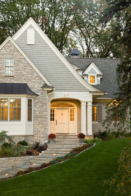
Traditional Exterior design by Minneapolis General Contractor Stonewood, LLC


After a lot of samples and clicking through pinterest we chose the following color scheme:


Sandy Hook: Board & Batten, Brick Front
Chelsea Gray: Shutters, Shakes around door and in the peak
Glass of Milk: Trim
Milk Pail: Door

The only color that may change as we continue on this project would be the door color. I am not 100% completely sold. I think it is very classy, but we might go with something a little more bold.

As we complete some items in the home, I will keep you updated! It is going to be a challenging, but fun project!

Have a fabulous weekend!

Wednesday, June 27, 2012

{Masculine} touches to your space

I don't know about you, but I am a girly girl. I like light pretty colors, lots of bling, classy chandeliers and PINK!....but I do live with a man. And he is a manly man! He likes texture, leather, dark wood, etc. So how do you marry these two decor ideas!!?? Good Question!

I have been searching the web to help me add some Masculine touches in my own home. I want my spaces to still feel classy and have a little glamour to them, but also want my husband to feel comfortable as well.

Here are some ideas I have found:

Sticking with neutral to dark color tones are the way to go for most men. This room seems pretty gender neutral. It has a small bar area with flat screen TV for the male touches as well as a woodsey patterned wallpaper. The pops of orange and the brass lamps bring in a bit of the feminine touches. 


Adding a bit of texture to each space also helps the men in our lives to relax. The dark walls and these beautiful leather desk chairs add that masculine touch while the Lucite desk and urchin chandelier add that subtle glamour. 


I love the look of this relaxed dining room. The high wing-back chairs with their clean lines add the masculinity, but the nail head trim with ribbon add that bit of sophistication. Black and white pictures are also a great way to add class to your home without going overboard with too much color!


Again the darker colors and the different textures around the room really add that masculine feel to this room, but with the pops of yellows and blues as well as the chrome fixtures make this a space for both genders. 


Oh I am loving this twin room. So many items in this room scream Masculinity....dark woods, rugs with different textures layered on top of one another, gray walls, natural elements from outside and neutral bedding. So where is the bit of glam you might say? I feel those fantastic sconces as well as that Persian rug are the pops of glamour. Wood, Metal and leather are heavy pieces. Make sure you pair these elements with a modern touch such as the sconces and artwork in this picture. 


Talk about Masculine Glamour! This room has just the right masculine touches like the black and white colors as well as the grey comfortable couch. But, it has so much glam to it that even a girly girl like me could live with!


Mixing old and new is another great way to mix the masculine with the feminine chic! The items surrounding the night stand seem old world, but the nail head trim on the headboard with the modern bedding is a mix made in heaven. How about that fabulous lantern!? I need want one!!


This bedroom might have a few more feminine touches than masculine, but I still like the neutral color as well as the rustic feel the brown tufted bed brings to the space. With all of the natural and neutral elements in this room, it could be a respite for any gender!


Summary: 
Masculine Elements- Wood, leather, metal, neutral to dark wall colors, clean lines & texture!

Pair it with some modern elements & minimal pops of color.

EQUALS

A perfect happy medium and one happy couple!!

Tuesday, June 26, 2012

Sherwin-Williams & HGTV Team Up!

When I was picking out paint samples for our investment home renovation, I came across a wonderful display at the Sherwin-Williams Paint Store.


I was pumped to find out that HGTV has their own line of paint, wallpaper and accessories at Sherwin-Williams. They have so many color palettes that you can pick from.

Coastal Cool


Color Pizzazz


Rustic Refined


I have not jumped on the wallpaper bandwagon yet! I just scrapped three rooms of wallpaper this past year and I just don't want to think about adding any more to our home...that being said, I do love some of the fabulous prints and textures that are now out. Wallpaper has sure come a LONG way!

I paged through the HGTV book of Wallpaper while waiting for some paint to be mixed and here are some of my current favorites:


I have been very pleased with Sherwin-William's products and accessories and 
I am still totally obsessed with Chip-It


Are you into the whole Wallpaper fad? I am not sure I want to wallpaper a whole room, but I think it would look fabulous in a 1/2 bathroom or along the back of a shelving unit. 

Happy Tuesday All!


Monday, June 25, 2012

Palm Avenue {Lilly Pulitzer Decor}

Happy Monday...BLAH! Started off a little rough, but now I am kicking it in high gear! HA!

A couple of weeks ago I visited a new store in Raleigh, NC. I always thought it was a clothing store until I walked in and got a glimpse of some major eye candy.


Like Whoa!... Palm Avenue carries many designers, but the one that sticks out the most is Lilly Pulitzer. She adds so much fun to any space. I always thought of her as a southern gal. Bright flower patterns, crazy color combos and LOTS of pink!


How adorable is this greek key side table next to Lilly's hot pink summer line?!


There were so many neat accessories at Palm Avenue.
Loved these sea urchins from Dwell Studios! Maybe one even came home with me! 


Fabulous lighting all around the store made it even more glam and irresistible!


So wanted this mirror and wall accessories, but when I looked at the tag...I had to rethink that!

At least I got a little modeling in before I had to say good-bye to the gold beauty....


The magnificent table setting and decor is what really got my attention!

How gorgeous it that Settee and those slip covered chairs?

The green and blue patterns were very playful, but also classy.


This table was even magnificent with a hint of Lilly Pulitzer inside the drawer!


Next time you are in the area you must stop by this amazing store! The decor designer changes out the designs every couple of weeks. I might have to be a stalker and show up once a week to get a glimpse!

There are also Palm Avenue Stores in:
 Greensboro, NC
 Charleston, SC
Savannah, GA


Happy Shopping! 

By the way....did you see my latest post on Facebook? If you did, then you would know what was delivered this past weekend! 


Thursday, June 21, 2012

Seriously Obsessed with CHIP IT!

Okay, so many of you who have been following me for a while know that I had a bit of trouble making a decision on a paint color for the entryway.

Well...I have found an amazing site from Sherwin-Williams that helps you find the right colors from inspiration on the web. It is SOOO easy! I can't believe I didn't know about this earlier. It would have saved me many trips to the paint store and a lot of money as well. I mean....I think I bought at least 11 paint samples for the hallway and at a price of at least $5-$10 a piece. Okay, I don't want to think about it!

So how many of you have been hiding Chip It from me? Huh? Are you guilty?

This website is a lot like Pinterest in that you drag the "Chip It" button to your tool bar and when you come across a picture or photograph that inspires you, drag the chip it button to the picture and let the colors load. You can then save it to different Chip It cards or Share your inspiration with friends. It's that easy! (Don't worry they also give you a tutorial if you go here.)

I am warning you ahead of time....It is ADDICTING! So watch out!

Here are a few color books that I have recently created:


Of course I had to add one of my Designer Crushes to the mix. {Amie Corley}


I know you are all probably sick of seeing my Front Door, but I wanted to see what color was closest to Calypso Blue by Benjamin Moore.


So what do you think? Have you already known about this site? (shame on you for not sharing!)

Tell me what pictures, paintings or photographs have inspired your paint colors!

Wednesday, June 13, 2012

For the Love of...

Blue and White


I am down at the beach this week and I have been seeing this color combo everywhere I look!


So it is only fitting that this color combo becomes my decor inspiration today. Enjoy!


Pottery Barn


Don't you just love the clean and fresh feeling this color combo brings to each space?!


Related Posts Plugin for WordPress, Blogger...

Total Pageviews