Showing posts with label color inspiration. Show all posts

Monday, January 25, 2016

Pantone Colors of the Year {Rose Quartz & Serenity}

Yes you read that right... COLORS of the year. Usually Pantone comes out with one color for the year but this year they decided to throw a curve ball in the world of color and design.

Introducing Pantone's 2016 colors of the year:


Some of you may love these colors while others may be a bit turned off at this color combination. Before you leave this post let me give you some inspiration that will either confirm your dislike for these colors or change your mind on these pastel-like colors.

Let's start with Rose Quartz....I am attracted to this color in small doses. Am I going to paint a whole room this color? Probably not. (unless my daughter wants a pink room someday, then we'll talk)  But a throw pillow or accent vase would add just a touch of pink without going overboard. And how about this door color? I might get on board with that! 


The table setting below really shows how both colors can be paired well together. And of course I love how they added a touch of gold!

source unknown


Now onto Serenity.....
I have to admit that this color in small doses would also work for me. However, I am not a huge fan of the purple undertones in this color so I am giving you a glimpse of more of a sky blue in some of these inspiration photos. 


unknown source


I am really drawn to spaces that have more of a neutral backdrop which bring out the pastel colors with a pop!

Can you get on board with the new colors of the year? Which inspiration photo is your favorite?

Have a wonderful week lovelies! 

Tuesday, November 3, 2015

{Simply White} Color of the Year

White? Really? It's the color of the year? My thoughts exactly until I saw some of the images below. You either absolutely adore this color and how it creates such contrast against everything in the space, or you despise it.


I am actually a huge fan of white! I know I have young kids and they will probably draw all over the walls and create some pretty sticky hand prints, but I don't care. We painted the nursery, master bathroom and dining room Shoji White and I haven't regretted that decision one bit.

What do you all think? Are you a fan of white or do you try and stay away from it? What is your "go-to" color?

Monday, October 5, 2015

Sofa Pillow Options- Need YOUR Vote!

Hello Hello! Can you believe this is the third week in a row that I posted something!? (Yeah...me neither considering some crabby babies over here. )
Anyhoo...I had a birthday a couple of weeks ago and my husband asked me what I wanted for my birthday. I told him to not buy me anything, that I wanted to pick out some pillow covers for the couch! So I am in need of a little help from all of you.

I bought this floral fabric when we were in Williamsburg last year. I know it isn't quite fall-ish, but I really love the colors and think it will help me steer the living room in the direction I want to go. The picture below reads more red than it really is in person. The background is more of a coral color.


My mother-in law was nice enough to sew the pillows for me since I would have to clean off an inch of dust off of my sewing machine. Haven't seen that sweet girl in months! The pillows below are my inspiration:

I am loving the contrast between the dark piping and the light neutral back. There are so many colors to pull from in this pillow that I am having a hard time deciding on a pillow combination for the couch. 

I currently have two large pillows on my gray sectional. I wrote about simplicity a while back and this post was my inspiration for why I chose only TWO pillows

Well after a few years of loving on these pillows it is time for a change! Take a look at my five options below and let me know what you all think!


I have to admit this one is a favorite of mine. I like the modern against the traditional. I feel as though my house is a bit like this combination. I have a mix of traditional family pieces as well as modern fixtures and lines within my home. 


Goldenrod Square Key PillowTeal Velvet Pillow
I get a more traditional vibe from the pillows above. The velvet lumbar adds a bit of texture as well as the pattern play between the other two.

Citron Velvet PillowDalmatian Print Pillow
This combination is a bit more modern. I love the dalmatian print against the floral. It really kicks the wow factor up a notch!


Gray & White Pattern PillowGoldenrod Square Key Pillow
Pattern, Pattern Pattern! This combination is also fun, but not sure I can pull it off!


Gray & White Pillow, Teal Velvet Pillow, Goldenrod Square Key PillowDalmatian print pillow
This last option has a mix of all the pillows to create a bit of interest. I do love this look and could really use a mix against the sectional.

Okay...your turn! Which option is your favorite OR do you have another combination you think might wow me? Give me your best shot!


Friday, April 3, 2015

A Touch of Pastel In Your Home

Can you believe it is April and Easter is in two days? Yeah...me neither! In Lou of Easter and all the pretty spring colors that seem to be floating around the stores and in mother nature, I have put together a few spaces that I have found that have just a touch of pastel. These spaces have just the right amount of that pail color.

When I think of pastel colors, I think of little baby rooms and/or Easter dresses. The spaces below feel a bit more sophisticated than that and I think you will agree.


source unknown


source unknown


What do you all think? Could you pull off a bit of pastel in your home? I think my favorite space would have to be that glam living room with the soft pink drapes. Now if I could convince my husband we need some pink in our home....

Have a wonderful holiday weekend! 


Friday, February 13, 2015

Decorating with a touch of Red

You all know that I am a fan of color. There really isn't a color that I don't like. Red use to be my favorite color. In our first home I even painted our master bathroom red. Like...red red. It took about four coats of paint and four people painting around doors, windows, tubs, etc.! I have learned over the years that in order to really enjoy color you have to interject it into your home little by little. Painting four walls red is quite a commitment and one I wasn't too pleased with after two years.

I truly feel that you get more of an impact when most of a space is neutral while adding color in accessories, accent walls or a piece of furniture. It creates a more cohesive/pulled together look.

Since Valentine's Day is tomorrow, I have pulled together some of my favorite spaces that showcase that "right amount" of red. You can take this same concept and integrate it with any bold color of your choice.


So do you like decorating with red? Are you an all out bold Diva or a conservative lady when it comes to adding color to your home?


Have a lovely weekend! Hope you feel loved and appreciated on this Valentine's weekend.
XOXO


Thursday, January 22, 2015

I've got the Blues....

No I am not down in the dumps, but I've been really crushing on dark navy/indigo blue lately. Do you ever come across a color that excites you? I have never really been into lighter shades of blue, but dark-dramatic blue is where it's at (in my opinion).
Whether you use the color on a wall, in a pillow or to add a pop of color to your bathroom vanity...I think it can be both classy and modern. Use some navy paint against white molding and boy the contrast is fabulous!
See for yourself.....


Are you a fan of dark blue/indigo tones? Where could you see this color used within your own home?


Some of my favorite Dark Blue Paint Colors:
Naval by Sherwin Williams: SW 6244
Hale Navy by Benjamin Moore: HC-154
Gravel Gray by Benjamin Moore: 2127-30
Newburyport Blue by Benjamin Moore: HC-155
Polo Blue by Benjamin Moore: 2062-10
Midnight Navy by Benjamin Moore: 2067-10


Thursday, January 15, 2015

Gorgeous Bedrooms with Dark Walls

I am thrilled to have a Guest Designer on Eat.Sleep.Decorate. today! Jane is here to talk about the new trend of going dark with our walls. She gives us some great tips and tricks on how create that dramatic room without having to go over the top dark. Personally I am a big fan of this trend. It seems to create something dramatic yet cozy. Enjoy!

********************************************************************************


Gorgeous Bedrooms with Dark Walls
By Jane Blanchard

Nothing transforms a room faster than changing the paint color. Try something new this season and add some drama to your bedroom with a dark, bold color. Dark colors add spirit, personality, and character to a room and there's nothing more dramatic than dark walls.

Most people think dark walls make a space dreary and depressing and, well, dark, but the truth is that a dark color is just as versatile as a light color. It's all about choosing the right color to define and highlight your room. Forget what you've heard about small spaces needing light colors. Using dark colors can actually make a small room look larger. These following examples show how to use dark colors on your walls to create your perfect bedroom.

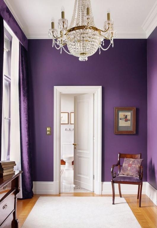
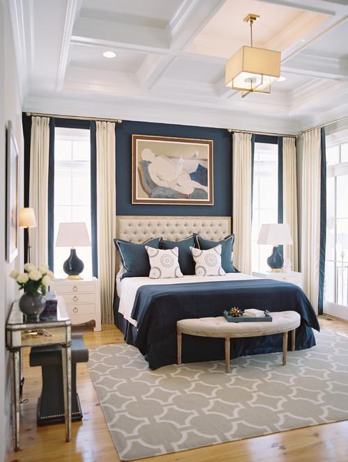
These rich walls highlight the chandelier and make this narrow space feel spacious.


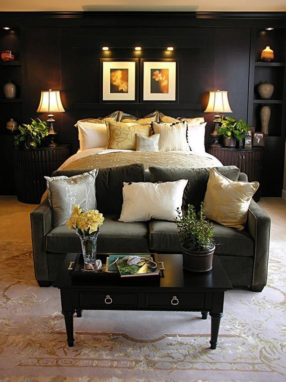
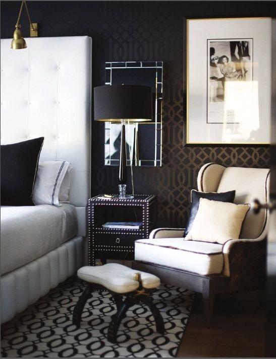
Dark colors also make a room feel intimate and cozy, which is a great effect for a bedroom. To keep the room from being too dark, it's important to spread lighting around the room and use accessories that reflect light.


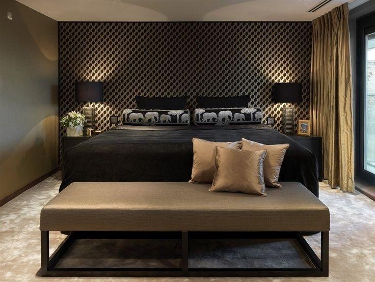
With dark walls, you don't need a lot of other colors or patterns. Dark walls provide the perfect backdrop for incorporating different textures. Add even more dimension using mirrors. This simple room uses a variety of fabric textures on the bedding and window treatments, but a very simple color palette to create an intimate space.


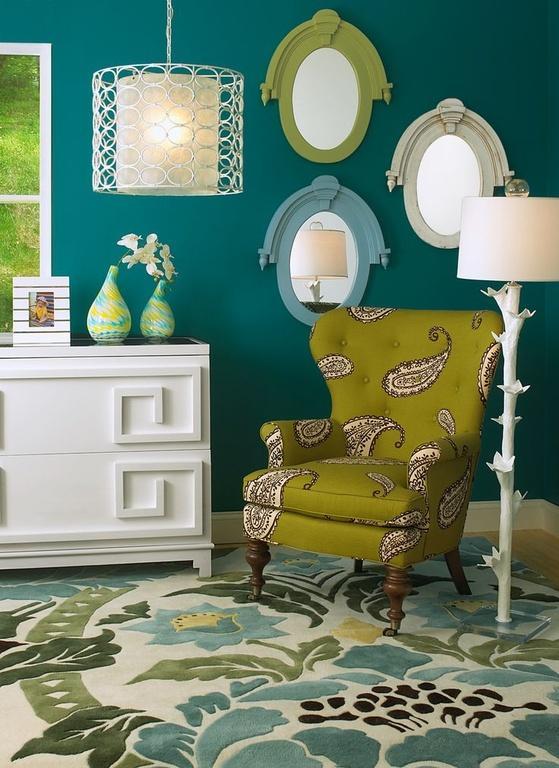
When using a dark color, it's important to create contrast. Using light fabric on furniture and for window treatments will make the room pop. Dark walls can also help tie together different styles of furniture. Choose furniture that is noticeably lighter than the wall to make the room appear brighter.


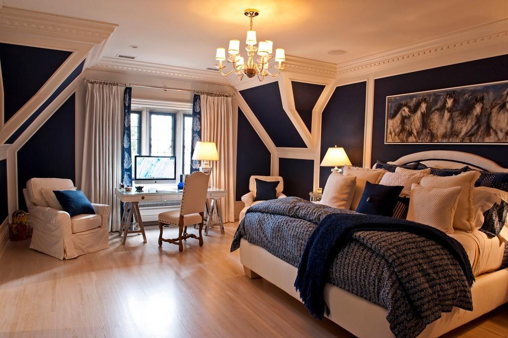
Dark tones can highlight architectural features and unusual wall shapes. Here the dark walls highlight the moulding and the unusual wall shape. The shape of this room would have been lost with light colored walls. Incorporating the wall color into the bedding creates a balance in the room.


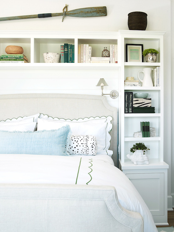
If you are hesitant to paint your walls dark, using a deep neutral tone can be a good compromise. A deep neutral tone can highlight bright colors, which makes your whole space look brighter. If using a saturated color, choose one contrasting accent hue so the room is not overwhelming.


Another solution is to use a dark color on only one wall. One dark wall can make a room seem larger and is a great way to bring some bold color to a space without too much commitment.


For more home inspiration visit Modernize.

************************************************************************************************************

Wow! So much great inspiration. I am personally loving the last picture with the darker blue walls against the beige/linen color. I really do like more of a high contrast rather than having the whole room dark like a cave.

Which one is your favorite? Could you dig creating a dramatic space with dark walls?

Related Posts Plugin for WordPress, Blogger...

Total Pageviews