Hello my lovely friends! It has been quite a while hasn't it? Well I have been out of town for 2 1/2 weeks visiting family and friends up in Western NY. It was a much needed vacation. We still worked some, but the view wasn't so bad...
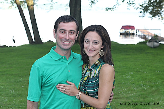
We celebrated our 8 year anniversary last week...
I had a nice visit with my grandpa....
And I got to spend some time with my college roommates and their families...
It was such a wonderful time, but I am very glad to be back home with all of you!...and this crazy girl.
But now...back to business. Today I am talking about my business cards! I am headed to the Haven Conference in just a couple of weeks and wanted to make sure that I have some new classy cards to accompany me.
I decided to go with non-traditional square calling cards. Aren't they adorable? My sweet friend Pam from Pixel Impress designed these for me. She has been amazing to work with!
Here is where your VOTE comes in! I am stuck deciding on a front and a back to this lovely card. The cards are numbered. 1-3 for the front and 4-5 for the back. Let me know which front and which back are your favorite!! I am torn between a couple of options and I know you all won't disappoint me with your opinions!
Can't wait for a fun filled week back with all of you. We are finally finished with our 4th flip house, so you will get a glimpse of some before and afters. I have also finished a few DIY's that I am dying to share with you.
Here's to a Marvelous Monday All!
Saturday Shopping | Travel Edition
7 years ago


#1 with #5 is a winner!
ReplyDeleteWelcome home! I love #1 and #5!!!
ReplyDelete#1 and #5!
ReplyDelete#1 and #5 do make a great combo but I'm feeling #2 and #4 - they look clean and modern. LOVE the square calling cards, by the way - excellent choice!
ReplyDeleteI think the Eat.Sleep.Decorate. banner on the bottom "grounds" the piece and doesn't interfere with the chandelier art; and I like the different but coordinating backgrounds for front and back...so #3 with #5.
ReplyDelete#1 is my favorite front and I am torn between #4 and #5 for the back. I think that either would be great. Love the square shape!
ReplyDeleteI vote for 3 and 5. Both are very striking and leave a lasting impression.
ReplyDelete1 and 4
ReplyDelete# 4
ReplyDelete1 & 5. Not feelin the mustard though...
ReplyDelete