Showing posts with label Gallery Wall. Show all posts

Wednesday, November 12, 2014

What to do with our TV Wall?

We have lived in our house for 6 years and I have never been happy with the layout of our family room. The corner fireplace totally throws me for a loop.

Our current TV wall and set up looks like this:


Besides the fact that we will need this space to function for a soon to be family of 4 (yikes), I want it to also look put together before the babes arrive. I have spent more time decorating different parts of the house because this room bugs me so much!

Last year the TV wall looked like this:

Even thought I loved my Pottery Barn inspired TV stand, it wasn't working in this space. It didn't fill up enough of the wall. I absolutely love the feel of the vintage white dresser that I purchased this past summer. I love combining retro, modern and traditional all into one room.

So here are my thoughts on what to do with that wall:
1. Possible upgrade to a bit larger TV to fill up more of the wall (not too big)
2. Large and small artwork flanking all sides of the TV
3. Personal photographs in black and white
4. Layer artwork slightly behind TV to give interest
5. Do something!


Here are a few TV walls that have currently caught my eye:


I love the idea of this gallery wall, but I am not sure if it is a bit much for me or not. I almost feel like there is too much going on, but I do like the mix of artwork and frames.


Pottery Barn
I have always loved this wall from Pottery Barn. The black and white with minimal objects on the TV stand call to me.


I like how Emily also flanked the TV with brass sconces for more interest as well as a need for lighting in her space. 


I have always loved the look of asymmetrical design. This wall is a bit heavy on one side with the lamp and artwork while the other is bare. Also the TV isn't centered, which I kind of like. 


Decisions...Decisions!

So what do you all think...Which TV design is your favorite? Do you have ideas for my sad wall?


Thursday, April 25, 2013

A Reader's Design Dilemma & Entryway Inspiration

A couple of weeks ago I was contacted by an old High School friend who reads my blog regularly. She is always supportive of what I do with my design ideas and thought I could give her a little advice on her entryway.

My friend Liz and her husband built their home about two years ago. After they moved in she found out she was pregnant and now has a beautiful little boy. So...she has not had much time to decorate her new place!

Here is what she wrote me:
Help! I need decorating advice!  I attached a pic of my entry way that I have yet to decorate. What are your thoughts on painting the inside of the front door? I just feel like it is so cold looking. I love when people paint them black but I am not sure it would go in my house. Also, I am at a loss on what should go on the walls on either side if the door. Any suggestions you could give would be greatly appreciated! 


Don't you love her home already!? I am in love with her ceiling light...anyway here are a couple more pics so you get the feel of her space.


Around the backside of this wall is the door to her basement.


Liz has a great space to work with. We just need to add a little character with lamps, pictures, plants, pillows, a mirror and accessories! 

Here are a few ideas that I sent her and where I think the space needs to go.


Let's start with the console against the wall to the stairs. I am thinking a round mirror to replace the picture. This will help balance the square console.  Also a lot of layering of items such as a plant, tray for phones & keys, a brightly colored lamp and/or lampshade as well as a family picture.


Even though this isn't a round mirror, I love all of the layering and how the antique look balances some of the more modern touches. There are so many different textures that totally work in this space.


If she didn't want to purchase a new mirror, she could always bring a small gallery wall above the console to fill the space on the wall or the second picture makes it simple with two prints stacked one on top of the other.


Now on to the bench area in the corner...


The bench has some great texture to it, but I would add a little pop of color with some pillows. Maybe a couple of wicker baskets underneath for a quick removal of shoes. Even a little task lamp would be neat!


She definitely needs a place to hang coats and/or scarves when company arrives. I would add either a small coat rack in the corner behind the door or some fabulous hooks above the bench.


If they decided to add a coat rack in the other corner or if they have a coat closet nearby, she might decide to do a gallery wall above the bench instead. I love this corner gallery wall where it wraps around two walls. It really makes a great statement and she could display all of her family photos as well as art prints.


Last, but not least is that entryway door. How do you all feel about painting that door black? I know it is very popular right now. I am not sure that it is needed, but if she were to paint it black it might look a little something like this.....


What do you think about Liz's entryway? Any other suggestions you might all have for making her space shine!?

I can't wait to see how she works her magic....pics to come!


Wednesday, August 8, 2012

DIY Dining room Gallery Wall {Etsy Inspiration}

A few weeks ago I talked about one of my Etsy Crushes. I am really in love with Nichole's Paris Prints and even more so now that I have traveled to Paris. They are much more meaningful. I finally ordered 6 black and white prints in 11x14 and I really love how they turned out.


If you remember the dining room wall looked like this before:


The new Gallery Wall really has filled out the space on that very large wall and I love how you can see it from different angles throughout our first floor.


If it wasn't for my dad, I would have never gotten these pictures up on the wall! I have had these prints for almost 2 months! YES...I know! I was afraid to tackle putting them on the wall in fear that they would be uneven and then I would have like 1 billion holes in the wall!!

My dad has that engineering mind and you can see from all his drawings and measurings below.

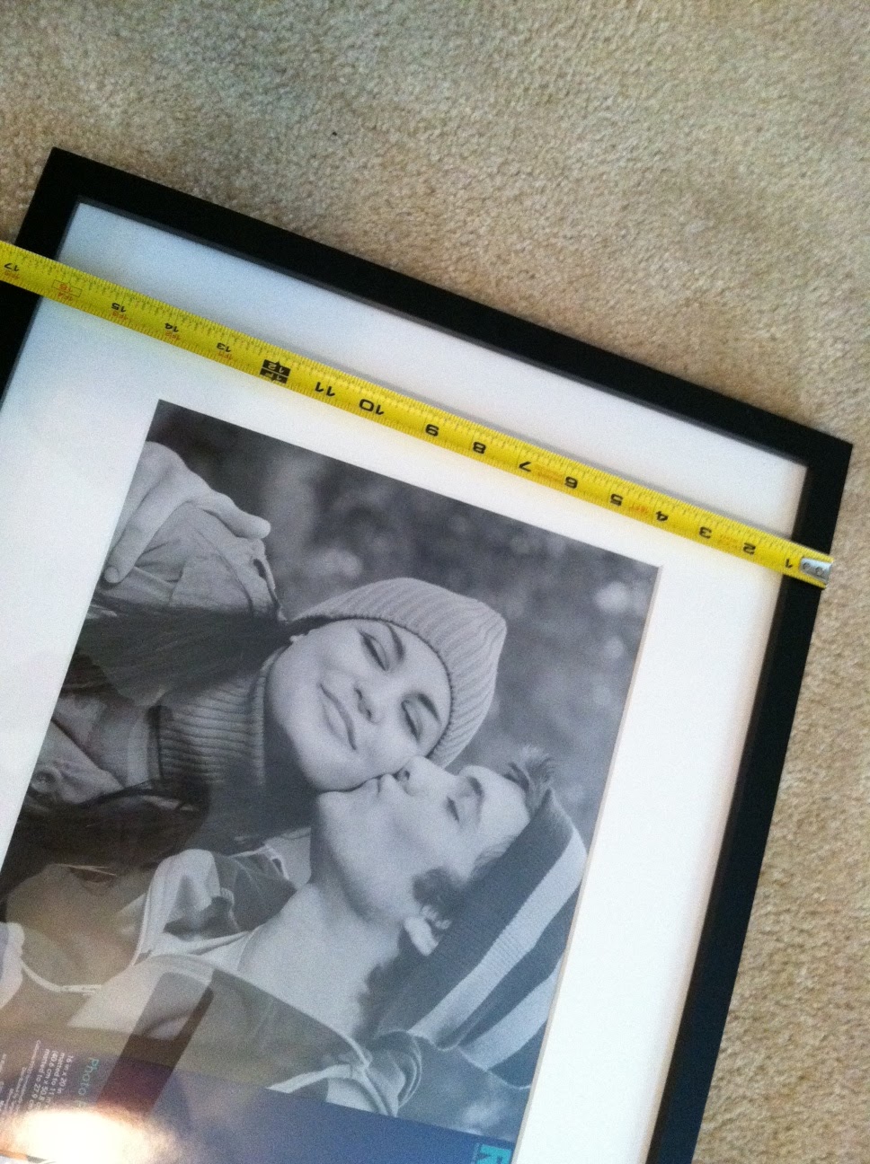
We first measured the width and length of each picture.
(no this is not me and the hubs all lovey dovey!)


Then we measured the length between the two hooks on the back of the frame to see how much wire was needed and how far from the top of the frame we wanted the wire. We then cut the wire for the NINE frames that I bought.

Then we laid them out on the floor to see how far apart I wanted them from each other. 
We decided that about 3 inches were perfect.


Then dad got to work.....

From one end of the gallery wall to the other was 69 3/8 inches. From the top of the gallery wall to the other it was 58 1/2 inches. From nail to nail going across the top there was 24 1/8 inches and going from nail to nail down the gallery wall was 20 3/16 inches. YIKES! That was a lot of measuring and I had NO idea what was going on.

Once we measured and put a bunch of pencil marks on the wall, it ended up looking like this....
And...it stayed this way for about a week with all of the lovey dovey's in the pictures! Of course it was driving me a little nutty, but I didn't have time to get the pictures in until this past week.


I am very happy with how it turned out! 
Now...I just need to add a little color to this space! Just you wait...I have a plan like always! hehe


PLEASE be sure to stop by again this evening....I have a fantastic GIVEAWAY!
And if you want other ideas for some gallery wall fun visit here and here. 
Or... follow me in my Gallery Wall Pinterest Page.


Linked up at:
TDC Before and After

Tuesday, September 13, 2011

Gallery Wall Progress

Hello! Hope everyone had a great weekend! It is already Tuesday and I need to get going with updating you on all of my great progress around this joint!

I few weeks back, I posted about different types of gallery walls. I really needed a change in my master bedroom. The wall opposite of my bed looked like this:


BORING! Right?..yeah you try waking up to that each morning! HA!

The floating shelves didn't even take up half of the wall space. They needed to GO! I had many of you vote for your favorite gallery wall on my previous post and here is the winner:


I really do like this gallery wall as well. I love how there is a mixture of black and white frames alternating with white or black mats. I also like that they mixed photographs and artwork on the same wall. It feels personal, which is what your home should feel like: A representation of you and your family!

So I decided to do the same thing in my bedroom, only I did add some color. I just LOVE color! I do like the calm feeling of just black and white, but I need a little punch of color now and again. Don't you?!

It took me a long time to decide what pictures and artwork to use. I have so many favorites, I didn't want to leave any out! After I decided on the pictures and art, I started laying my frames out on the floor to get a feel of where I should put each picture.


Once I arranged the pictures the way I wanted, I started to trace the outline of each frame using wrapping paper. (I know right?...that is all I had around the house and it was free!) I then cut out each piece of paper and started hanging them on the wall with blue painters tape.


The reason for this long step is to make sure you have the correct distance between the frames that appeal to you. I didn't want large gaps between my frames, but I also wanted to make sure that the frames took up a good part of that boring wall.

Once I had all the papers the way I wanted them, I started pounding some nails! Then the rest is history!

Check...


It....


Out....


I think it really turned out great! It is hard to tell in these pictures, but it does take up a big part of that boring wall. I also have plenty of room to expand my gallery wall as I find new pictures or artwork that MUST go into my master bedroom.


I even framed a couple pieces of fabric as artwork. This fabric is being used throughout the master bedroom as accent pillows or chair covers.


I found this little beauty in my parents attic! My dad drew this when he was in high school. I thought it was so neat to have an artwork piece from him in my room.


Of course I had to bring in the paint chip artwork that I made! I just love it!


Each frame has a different thickness to it. That brings another element of artistic nature to the gallery wall.
(Sorry about the vent in this picture..there was no way around it!)


Ok One Last Before and After!.....

BEFORE


AFTER


Quite the transformation...I think! It will continue to be a work in progress as I add more photographs and artwork over the years.

What do you think?!

Amy ©


Linked project with: Homestories AtoZ


Saturday, August 20, 2011

Master Bedroom Gallery Wall

We have a large wall opposite our bed in the master bedroom that needs a little TLC. As you can see from the picture below there is a lot of space that needs to be filled with something!


I have been racking my brain on what to do with the large wall space. Then I saw some great gallery walls on Pinterest. They have inspired me to try and create a gallery of my favorite pictures, prints and paintings.

Here are a few of my favorite gallery wall ideas:


YHL


There are so many ideas to choose from. Should I do same color frames? Multi-color frames? Should I make the frames symmetrical? Should I scatter and stagger the frames? Should I have a specific theme? All pictures? Mix pictures, drawings & paintings?

Seriously people….I need some major help! What do you like the best?

Amy ©


Related Posts Plugin for WordPress, Blogger...

Total Pageviews