A couple of months ago a dear reader emailed me asking for help with her living room. Natalie had just painted the living room a light green/blue/gray and that was it. She needed some inspiration and ideas to help finish her space. Natalie told me that they needed to keep the tan couches, the wood molding was staying as is and that she had bought a cute little white lamp for her side table, but other than that it was a clean slate!
Here are a few before pictures so you can get an idea of Natalie's living room space:
When entering from the front door there is a small wooden console and a blank wall to the right. To the left are a large set of windows and then you see the love seat between two smaller windows:
And the couch sits against a larger blank wall:
I am excited to add some personality to this space. It already has amazing features like hardwood floors, trim around the windows and arched doorways! If you scroll back up to the second picture you will notice a little accent chair sitting in front of the large windows. Natalie actually has two of these and would like to upholster them in some sort of yellow fabric. She also has an 18 month old son who is busy busy, so we had to design this space with him in mind.
After talking with Natalie about her likes, dislikes and ultimate design I think we have a bit of a plan for her space!
I am thinking that she is in need of a great art piece above the love seat and between those two smaller windows shown in picture two. She is also going to change out those wooden blinds in the small windows. I am pushing for roman shades like these:
They would really soften the space and contrast well with the darker wood trim.
I also recommended a great big gallery wall to fill up the space above the couch in picture three. I think a mix of art and photographs would be perfect.
As for that entryway right next to the door in picture one. I would recommend either a higher console with drawers, a mirror above and artwork down the sides to fill that space...
source unknown
OR..if they are going to keep their existing lower console I would place a large mirror vertically above and sconces on either side or tall lamps of some sort.
This space also needs to be filled with baskets to hide toys and I recommended a large ottoman with storage for the middle of the room. It would be kid friendly and a great piece to add storage for her son's toys.
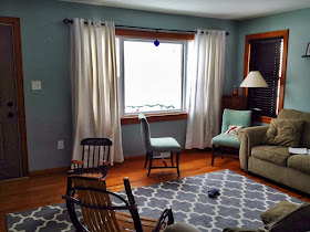
She recently sent me a "progress" picture from her phone. (sorry for the dark pic) She has added the white curtains across her large front windows and picked up the large Moroccan trellis rug from Target. The room already looks better and is forming a personality!
I hope to be able to share some final pictures with you all very soon! Do you all have any ideas or recommendations for Natalie as she finishes her living room design?


No comments:
Post a Comment