Over the next few weeks I am going to recap what they taught us and how you can use this information to help create a more inviting home for you and your family.
First up.... Number One: Too Much of a Good Thing
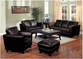
This refers to matchy matchy furniture. You all know the sets that come together like a large couch, love seat, ottoman and chair that are all the same color and fabric choice? Don't worry if you have this in your home because I was also to blame when I first got married.
Don't get me wrong, some of these spaces are nice, but very boring! Our eyes just kind of stop at the dark matchy furniture. There isn't anything to excite us....no texture, color, variation of wood, etc.
I know that going into a big box store and picking out an already set up room is the easiest idea ever, however it isn't the best for making your house feel like a well designed home. If you are struggling with this design mistake at home...don't worry! There are so many people that do and that is why there are designers or friends to help a sista out.
I am going to show you a few ideas on how you can incorporate your matchy furniture, but change it up a bit.
This picture is a great example that you don't have to get rid of your matching furniture. Emily showed us this picture and I couldn't believe how adding different types of end tables and pillows can hide that matching furniture. In this picture they have matching leather love seats. By adding different texture end tables like the rustic wood coffee table, metal garden stool and high wooden end table your eyes can move from object to object and like what they see! Adding some textured pillows also makes a grand impact!
via
How about keeping your existing matching furniture set in the bedroom, but add a little paint to the side tables? This would help the room stay cohesive, but also add interest with different tones of paint. Adding a bench with a graphic pattern at the end of the bed is also a fantastic idea which lends texture and interest.
This bedroom says the opposite from the previous picture. Keep your existing end tables, dressers and even bed frame, but add some interest in a textured headboard. Staying with the same tones in the woods, but adding a fabric headboard does wonders in creating a well designed room.
This dining room is another great example of adding a few items to hide the matchy matchy furniture. You can see that the side dining chairs and table are matching, but adding different end chairs in different fabric really create some interest. Also adding the light drapes that contrast with the darker furniture really opens up this room and adds a brighter element.
How about all of you? Are you guilty of matchy matchy? Do you have some matching furniture that just needs a little tweak like the spaces above?
If you are stuck in your design mistakes, email me some pictures of your room and let's create a more inviting place! eatsleepdecorate (at) gmail (dot) com


GUILTY!!!!!! I'm going to mix it up very soon though when we do a house renovation and I'm going to use some of your ideas. Thanks so much for the tips.
ReplyDeleteYou are welcome..and I am sure there are many people that are guilty of this one. Send me pics and let me know how it is going. Would love to help if you have any questions!
Delete