Friday, May 31, 2013

Fabulous Feature Friday {The Chronicles of Home)

Man...did this short week seem long to all of you!? I am so glad that it is Friday. The Hubs is back from his long trip and we are set to stay home this weekend with some minor projects in mind, but mostly relaxation after this busy week!

Today's Feature is Jennifer from The Chronicles of Home. She has amazing taste and really makes her home a comfortable and fun place to live. I could seriously curl up on her couch with a good book and stay a while!

Hope you enjoy the tour....


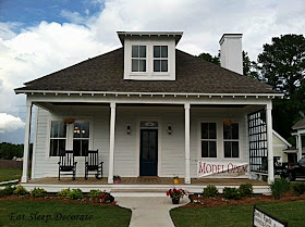
This home has amazing curb appeal...does it not? Absolutely adorable, timeless and classy!


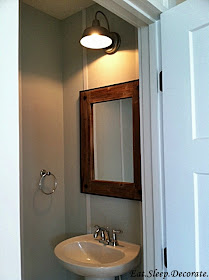
This is the master bathroom which they totally rearranged and renovated. I absolutely love the cabinet with the furniture legs. It adds a custom feel to the space!


The play room is just adorable. Make sure you stop over HERE and check out the rest of the pictures and Jennifer's amazing toy organization!


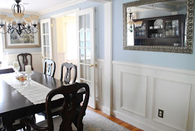
Jennifer has such a beautiful home. I think my favorite part of her home is all the molding she has throughout. The bead board, boxed and crown molding all add a lot of character to her home. The breakfast area is so bright and calming. I don't think I would ever leave! To see more of her home click HERE.

What was your favorite part of this home?


Thursday, May 30, 2013

Reader's Design Dilemma {Playroom/Sewing Room Inspiration}

Today I am sharing some ideas on how to marry the idea of sharing a Sewing/Craft room/Office with kids.

A few weeks ago I got this email from Mandy:

Hi! My name is Mandy Mitchell. I need help with our playroom. Please excuse the mess!

I want this room to be a fun playroom for my 2 year old. He has tons of toys that need better organization than I have. I would like to have a bench with storage to watch a television.

The other function for the room is to be a sewing room for me. I painted a desk to act as a sewing desk but it just needs more. I want to brighten the space and make it more fun! It's BORING! Any inspiration would be wonderful! Thanks!

Mandy M.


I was so excited to start working on this project. Like Mandy, I am sure many of you have a room in your home that has a double duty. It is very important to designate zones to your space. Each zone must have a purpose and/or function with lots of organization! 

Let's see how Mandy's room looks now:


Mandy really has a great space to work with! A blank canvas, which is a designer's DREAM!! 

Let's Start with this zone first:

Mandy needs this wall to function for her sewing and craft supplies. I am thinking that something below might give her some storage for her supplies, but also give her some extra shelves for her son's toys.

I like the above plan because it gives the room some color without going overboard. It keeps the space fun for the kids, but also gives mom a little sophistication. If she didn't have room on that wall for two flanking bookshelves, Mandy could always reuse the one she already has on the other wall. Don't you love the painting!? It definitely brings a little fun to the space! These shelves could act as storage for Mandy's supplies, but she could also add some bins and/or baskets to hide some of the toys away. 


Moving on to the second zone:


Mandy was saying how she was going to add a TV in this space. How about finding some kind of horizontal shelving or even a thrifted credenza to not only hold the TV, but also house more toys and books?

Since the last mood board was a little more about mom and less about the kids, make this side of the room pop with some fun kid art above and around the TV, making a type of gallery wall. 


The Opposite Wall looks like this:


It is a bit smaller because of the doorway entering in on that same wall, but still needs to have a function. I was thinking a little art/craft/play area for that small corner. I noticed Mandy already has a very small desk there for her son.


I am thinking a large map that could really fill up that wall and make a bit of a statement. Adding a couple of kid chairs and a table would really make it useful for any kids' space! I also added a small shelf right below the map. This could be used for books or even crafts supplies. The chalk board could be added to the left on that small corner next to the window. I am starting to wish this was my space! Can't get enough!!


Last, but certainly not least is the window area:


Mandy suggested a type of bench where she could have more storage. I do like that idea and will have some inspiration on that as well, BUT I really do love having a bit of functional seating like the settee below!


Remember this is a kids space, but it also needs to be a fun place for mom too! I absolutely adore this settee from Target. It could be placed directly in front of the bay window so it isn't in the middle of the room, but could also see the TV from that view. Adding floor to ceiling drapes would be wonderful. They don't have to be expensive. They could be white with a bit of an accent ribbon to give a little pop of color. Aren't those animal prints adorable!? Adds a bit of whimsy, but keeps the space classy for mom. 

I know that Mandy was thinking about a bench for seating and storage, so I also found these inspiration pics in case she was set on having a bench.


I adore this built-in bench below the bay windows. This would be perfect if Mandy knew a handyman!

I am also adding this last picture as inspiration for colors. I am not sure if Mandy was open to painting her walls, but how fabulous would these dark blue walls be against her green desk!? She could add lots of fun blue and green patterns throughout the room. Adding some white storage would also tone down the blue walls and gives some balance & dimension.


So what do you all think? More importantly...what does Mandy think? I hope this gave you a jumping off point for your wonderful space. It sure was a fun project to work on! PLEASE send some after pictures once your space is finished. If you would like to see the sources and inspiration pictures please go to THIS pinterest board I created for Mandy!

Alright...I have another great reader's space coming up next week. This amazing reader is all the way from Belgium! I can't wait for you to check out her fabulous space.

Who else needs some design help? Send me 3-5 pictures with a description on your design dilemma via email to eatsleepdecorate at gmail dot com!! 

Have an amazing day everyone!

Linked up: Liz Marie Blog & Thrifty Decor Chick & Suburbs Mama

Wednesday, May 29, 2013

Updating our Dining Room Chandelier

I have a quick post for you all today! You know that most of the time I work from home. I am in charge of all of the pendings and listings for our real estate business. Well...I switch it up and sometimes need to work downstairs where there is more light and a different change of scenery. I really should just stay in my office because then I would stay out of decorating trouble.

Last week I decided to work at the dining room table. After every email I would look up and see my little beauty chandelier.


I bought it four years ago from a local lighting store. It is pretty traditional with a little bit of whimsy. As I gazed up at it throughout the day, it became clear to me that it needed a little change. Nothing crazy...but just a little update.


I decided to change out the light bulbs for a more modern look. I love when something so traditional can also become a bit modern.


I added these round bulbs and I couldn't be happier! Not sure how many visitors will really notice, but I will notice and that is whats most important...right?


What do you all think? Do you like the more traditional look with the pointy bulbs or the modern look with the round bulbs?

They are keepers for now in my book!

Linked up: Liz Marie Blog & Thrifty Decor Chick & Suburbs Mama

Tuesday, May 28, 2013

Two Pillows Made for our Couch

Hope you all had a wonderful long weekend with family and friends. The Hubs was out of town this weekend, so I was excited to get some major projects done around the house! Can you believe that I tackled his whole office and it is almost done? I can't wait to share some of the DIY's and updates very soon.

A few months ago I showed you some inspirational pictures of living rooms, with one idea in mind...


...adding simplicity into my pillow hoarding abilities. I wanted to keep our new sectional couch clean and simple. No more millions of pillows being tossed here and there.

Here is a BEFORE picture so you can really get a feel for the space:


And...here is the After:


Don't you think that two pillows that add a little drama are better than a whole mess that don't do anything for the space!? I am really loving how they look. They just add a bit of glam and color to the much needed living room.


I used an Ikat fabric from JoAnn's that I purchased months ago. It is from their Mill Creek line. I added a gray linen to the back. Believe it or not, this pillow was made from a body pillow that was purchase from target. I had to cut it down a bit to get the exact size I wanted. These pillows are pretty large. The measurements are right around 19"x38". Aren't they just fabulous!? hehe


Here is one last before and after.....


So what do you think!? Could you pair down your pillows and just create some large ones that give a sense of simplicity?


P.S. Who noticed the the new curtains as well? That DIY is for another post! Stay Tuned!

Linked up: Liz Marie Blog & Thrifty Decor Chick

Friday, May 24, 2013

Patriotic Entertaining Ideas {Memorial Day}

Happy Happy Friday! I hope you all have lots of amazing plans for this long weekend. Some of you might even be getting the party started early today!


As we get ready for this Memorial Day weekend, let us not forget the real reason we are able to have BBQs with friends and family. Take some time out of your busy weekend to pay your respects to those who have sacrificed for our freedom. What an amazing country we live in!


Are you entertaining or being entertained this weekend? Either way below are a few ideas that I have found out and about on the web. These would even work for the 4th of July if you have already planned out your weekend.


How adorable is this patriotic table by my friend Cassie from Hi Sugarplum! I love the red dalmatian printed table cloth. There is just the right amount of each color.


If the weather is good, you could always pull your sideboard outside and make an adorable serving area for your friends and family. 


Doesn't this Red, White & Blue Sangria look amazing? Click HERE to get the full recipe as well as many more patriotic drinks for your holiday weekend! 


source unknown

This is a great idea! One serving set per person. Using colorful bandanna's as napkins with utensils all set into a ball canning jar = perfection! This could be used for any event!


I am sure many of you have seen this picture with the fruit skewers  How yummy and perfect this would be for a family party!?


Does this dessert look delightful or what? This is actually a gluten free Ice Cream Pie! If you haven't visited the Yummy Mummy Kitchen, you must! So many wonderful and healthy recipes! 


So, tell me...do you have a Memorial Day Tradition? We use to spend the whole weekend as a big family at my parents cottage on one of NY's finger lakes. Now that my parents live down here in NC, we don't have a specific tradition. I guess we need to start one! 

Have a wonderful long weekend my friends! See you back here on Tuesday!


Wednesday, May 22, 2013

A Cottage Home Tour

This past Monday I spent the afternoon with my sister-in law. She was getting ready to go out of town so I wanted to spend a little quality time with my niece and nephew. We went to get some Ice Cream, which you can see was a HUGE hit!


On our way back to their house my sister-in law asked if I wanted to go and check out the cottage models at a nearby neighborhood. If you have been reading this blog long enough you know how much I love design and real estate! How could I pass that up? (Side note: my nephew was also very excited. He is only 3 years old and loves to go in open houses. Guess he takes after his pretty cool aunt! :)


Here is the first model we went into. Isn't it just adorable. I love the curb appeal....it just says "Welcome Home"!


Off to the left of the home was a two car garage with a HUGE unfinished room above. It could be used for a separate office or bonus room for the kids! Take a look at how they designed the driveway of each of these homes. Little patches of grass down the middle. I just love the added touch!


The house is the palest blue I have ever seen. Just a touch of blue makes it so unique. Off the back of the house is a separate porch and entry.


How about the porch ceiling and light fixture? The ceiling shows more brown in this picture thanks to the phone pic, but it is actually a dark blue. So fun!


As you enter into the house from the back porch, you walk right into this amazing kitchen. Knotty pine floors are the show stoppers in this cottage. 


Pretty blurry picture, but I just adore this half bathroom. The reclaimed wood mirror, light fixture and pin-striped molding is perfecto!


Now...I don't know about you, but I like the idea of an open concept shower, however I am just not feeling the retro black and white tile combo with the cottage feel board and batten. Anyone agree to disagree?


Upstairs were two bedrooms with beautiful windows and these amazing built in benches. My model in the above picture really enjoyed looking out the windows. Also, what do you think about the doors? They are three panel doors, but the molding is totally different than what I am use to. I am indifferent, but my sister-in law loved them.


I know this is a weird shot of the house/garage, but I just loved the different levels of roofs. This is looking out one of the upstairs windows. These roof lines lead from the back porch to the garage. I just love architecture, don't you?


Back downstairs this is looking into the dining area from the living room. Not quite sure why the walls look so pink in this picture. I swear to you they were creamy-white. The stair railings were definitely different as well. Not sure if they look cottage like or just cheap! 

It started raining so unfortunately I didn't get to go into the other models, but I did take a few pictures of other cottages in the neighborhood.


Don't know why I am so in love with those grassy patches in the driveway!


Bad picture, but look at this southern beauty. I love the double decker porches!


This is the last picture before it down poured. You can actually see it raining if you look close enough. Won't this porch be absolutely stunning once the vines grown up and around the trellis? There is nothing better than a front porch in the Springtime in NC!


So that was my fun and unexpected Monday afternoon! How is your week going? 
It is Hump Day ya know?!