My friend Liz and her husband built their home about two years ago. After they moved in she found out she was pregnant and now has a beautiful little boy. So...she has not had much time to decorate her new place!
Here is what she wrote me:
Help! I need decorating advice! I attached a pic of my entry way that I have yet to decorate. What are your thoughts on painting the inside of the front door? I just feel like it is so cold looking. I love when people paint them black but I am not sure it would go in my house. Also, I am at a loss on what should go on the walls on either side if the door. Any suggestions you could give would be greatly appreciated!
Don't you love her home already!? I am in love with her ceiling light...anyway here are a couple more pics so you get the feel of her space.
Around the backside of this wall is the door to her basement.
Here are a few ideas that I sent her and where I think the space needs to go.
Let's start with the console against the wall to the stairs. I am thinking a round mirror to replace the picture. This will help balance the square console. Also a lot of layering of items such as a plant, tray for phones & keys, a brightly colored lamp and/or lampshade as well as a family picture.
Even though this isn't a round mirror, I love all of the layering and how the antique look balances some of the more modern touches. There are so many different textures that totally work in this space.
If she didn't want to purchase a new mirror, she could always bring a small gallery wall above the console to fill the space on the wall or the second picture makes it simple with two prints stacked one on top of the other.
Now on to the bench area in the corner...
The bench has some great texture to it, but I would add a little pop of color with some pillows. Maybe a couple of wicker baskets underneath for a quick removal of shoes. Even a little task lamp would be neat!
She definitely needs a place to hang coats and/or scarves when company arrives. I would add either a small coat rack in the corner behind the door or some fabulous hooks above the bench.
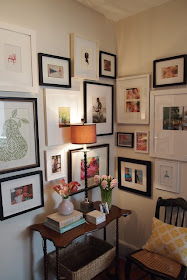
If they decided to add a coat rack in the other corner or if they have a coat closet nearby, she might decide to do a gallery wall above the bench instead. I love this corner gallery wall where it wraps around two walls. It really makes a great statement and she could display all of her family photos as well as art prints.
Last, but not least is that entryway door. How do you all feel about painting that door black? I know it is very popular right now. I am not sure that it is needed, but if she were to paint it black it might look a little something like this.....
What do you think about Liz's entryway? Any other suggestions you might all have for making her space shine!?
I can't wait to see how she works her magic....pics to come!


Wow Amy! I love your ideas! I have an idea also, why don't you make this a regular feature in your blog, where you solve others decorating problems. I love to see what you come up with! Many would work in so many of our homes. Keep up the awesome work!
ReplyDeleteGreat idea Laurie! I will send out a post this week!
DeleteShe has a lot of great things to work with. Love what you came up with. I vote for the door to be painted black!
ReplyDeleteI am thinking more and more that it should be black as well!
DeleteYour friend has a beautiful house. Love the hardwoods!
ReplyDeleteI like the idea of the coat rack or hooks, but would place them behind the door. I think placing them above the console table would clutter up the entry way. I also agree that a mirror is needed somewhere in the area. Above the console seems to be the best spot.
I don't think the door needs to be painted. Maybe a pop of color on it with a sheer color curtain or fabric gathered in the center of the window. Another option is to paint inside the two small squares on the bottom. Maybe coordinate that color with whatever she decides to put on the bench to the left.
I love your blog .. you always have great ideas.
Thanks for your ideas Roberta!
DeleteI second this idea! I'll start taking pictures :-)
ReplyDeleteDid Amy address the wall to the left of the door (as you enter from the door)?
Ha! Would love to do a series on solving dilemmas! Janet...I was thinking either hooks or coat rack behind the door. Or if she opts for hooks above the bench, she could always do a gallery wall behind the door.
DeleteThanks Annabelle!
ReplyDelete