Wednesday, March 27, 2013

{DIY} Outfit Pinspiration Board

Today's post is another one of my crazy DIY projects. It all started after seeing this office pin board on pinterest a few weeks back. I loved how simple the project was, but also what an impact it made in the small  office space.

How many of you go to your closet and just stare at the mass of clothes only to "have nothing to wear"? Does this sound familiar? Well this happens to me a lot and usually my whole room ends up looking like some natural disaster.

I came along this quote.....


HAHA! Isn't this so true? That is what I thought..... then a light bulb turned on! (Are you still with me? I am kind of rambling today)

I thought since pinterest is such an inspiration that I should use some of the outfits from my pinterest board to give me inspiration in the morning, especially the mornings that I am NOT inspired by my own wardrobe. 


Thus today's DIY....an Outfit Pinspiration Board in my closet!!

I bought these 4 square cork boards for $6.00 at Tar-jay....


Then I taped off each board to create a different pattern with painters tape.


I added some gold paint that I had leftover from my polka dot mugs.


And...this is how they turned out...


Aren't they adorable!!?? Think of the possibilities!


I then added these little guys to the back of each cork board and hung them up above the reclaimed wood hooks behind the door in my closet. 


Then came the hard part...picking the outfits that would inspire my own wardrobe! I printed these out from my own Outfit Pinterest Board.


I cut the pictures out and literally "pinned" them onto my own inspiration board.


What do you think? I need to add some more outfits as our season changes into Spring. 
I sure hope this will help me with my indecisive nature. It will at least
keep my room safe from natural disasters!


Have a Fabulous Day!!


Tuesday, March 26, 2013

New Flip/Investment Home {Before Pics}

We are at it again! This will be our fourth investment home within the past year. Two have been sold and our last one has been on the market a little over a month with 26 showings! Will someone just give us an offer already!??

This new investment was built in 1995 and is just East of Raleigh. It has 3 bedrooms 2 1/2 baths and around 1900 sqft. It has great bones and a fantastic layout...but this guy just needs some love. See for yourself!


Not sure what was going on with the awning over the door! Maybe they were trying to sell something. We will be getting rid of the green altogether and going with a neutral/classy palette such as gray or tan exterior with black shutters. Not sure about the door color yet...we will see!


The siding is in pretty good shape. We will be replacing a few boards near the chimney and power washing the back deck. The whole exterior will be getting fresh paint!


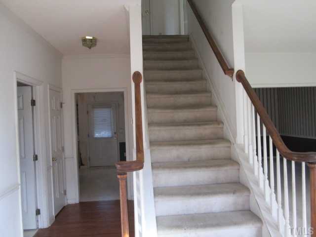
Here is the Oh So Boring entryway. New Carpet, New Paint, New Lighting fixtures are what's in store for this Ugly Entry...


To the left of the staircase is the most gorgeous dining room you have ever seen! Right?? Wall paper will be taken down....walls repainted and definitely a new light fixture!


To the right of the staircase is the living room. Beautiful 9ft ceilings will be enhanced by some crown molding. New Paint and Carpet will also be in order! We would have loved to add some new wood floors, but it just wasn't in the budget for this home.


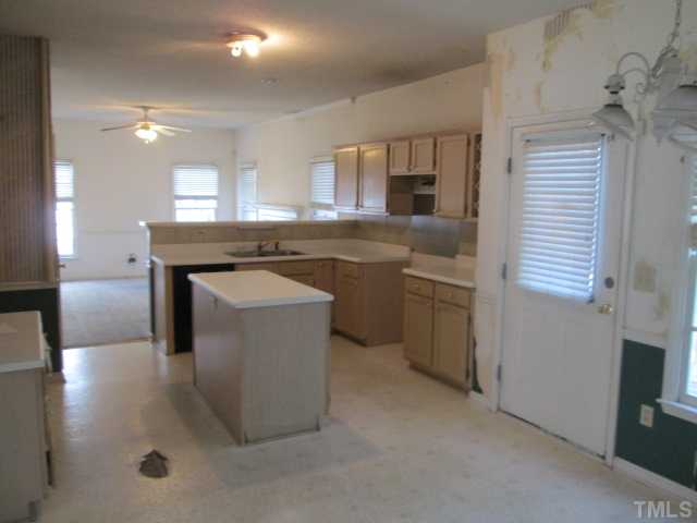
Straight down the entrance hallway is another fabulous room (Okay...will be fabulous)! The kitchen is in pretty rough shape. Don't worry...with a little paint, new floors, new light fixtures and appliances this beauty will shine once more! Cabinets will be going all white and we will be replacing the counter tops as well. (Will keep you updated with choices as we move along!)


The Kitchen is open to a great family room with a fireplace and lots of natural light!


Last picture I have is of the grand master bedroom! It is a blank slate and I can't wait to dive in! Fabulous vaulted ceilings really make this room feel spacious.

So what do you think!? It is going to be a great home and we can't wait to get going on this project. The renovations should only take about a month since most of the work is cosmetic. We aren't tearing anything down except the front porch railings.

I will keep you posted along the way! If you follow me on Instagram @eatsleepdecor, you would already know that I have been busy picking out exterior paint colors! Wish me luck!

To see our Completed Flip Homes...go Here.


Monday, March 25, 2013

Jonathan Adler for {JCPenny}

I have been a little under the weather this past week and when I am sick I seem to surf the web to find the most amazing things. I was on pinterest the other day and came across an adorable lamp with the label "Happy Chic" by Jonathan Adler for JCPenny. I was like....what? So I did a little investigating of my own.

Lo and behold Jonathan Adler has designed his own line of Bedding, Furniture, Lights, Rugs & Accessories for JCPenny's!! I can't believe it. JCPenny's has really been on their game lately with fashion at low prices, their tearjerker Commercials and now Jonathan Adler. WAY. TO. GO.!!

You can check out Jonathan Adler's full line HERE. For Jonathan Adler products I would say that they are fairly priced. They still may be a bit outside of my budget, but some of the items I could totally rock in my home.

Below are a few of my favorites from his new line.


What do you think about the "new" JCPenny? Do you shop there? Would you now.... that you know your man Jonathan Adler's line is there?

Happy Happy Monday All!


Tuesday, March 19, 2013

For the Love of.....{All White Rooms}

I am not sure if it is getting older or the time of year, but I have been obsessing about simplicity and a place to feel calm and relaxed.

Did you know that there is a little psychology behind Color? Well there is. A specific color can make you feel energetic, angry, strong, gentle, sexy, compassionate, etc.

Here is a little color theory on the color White:  pure, clean, pristine, spotless, innocent, silent, lightweight, airy, bright, clarity, simplicity, artic.


You tell me how these spaces below make you feel:


What do you think? Do these white rooms make you feel relaxed or do you need a little color in your life?


Monday, March 18, 2013

My Weekend Find {Jewelry Organization}

We are talking thrifty finds today. Do you get jealous when someone finds an unbelievable deal at a thrift store? I DO! I have gone to Habitat Restores, Goodwill and many many thrift stores. I really rarely ever find fabulous deals like most of my friends do. I seem to always be looking for a specific thing and then get discouraged if I can't find that item. Maybe I need to take a different approach and just enjoy looking around, then some fabulous deal with pop right out at me!

I am also not a big collector. I want my house to feel collected overtime, but I don't want knickknacks all over. I am really trying to simplify my life and just put items around my home that have meaning or that I absolutely love and know I will have on display for many years.

Well this past weekend I had a few minutes to waste and popped into a local thrift store here in town. I only got one item....but I am kind of in love with it.


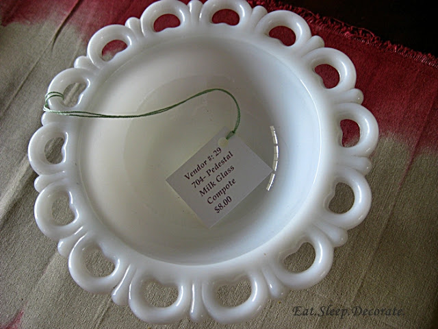
I got this milk glass bowl for $8.00. It is in perfect condition! As soon as I saw it, I knew I had that perfect place where it could be on display. I also knew it could be a functional piece!


I decided to make it into one of my jewelry organizers.  The little decorative loops on the edges are perfect for my earrings and the bowl can hold my frequently used bangles and cuffs.


It is such a simple and cheap way to organize the jewelry that usually gets stuffed into drawers. Now I can put those pieces on display!


Have you found any unbelievable deals at local thrift stores? Do tell!!


Linked up at: LizMarieBlog & ThriftyDecorChick& 504Main & SerenityNow

Thursday, March 14, 2013

Adding Character to your Home {Lighting} Part 1

Last week I introduced you to my builder grade home and let you in on a few molding secrets that added a little character to my once blah home.

Today we are talking about lighting. I am very excited about this topic because I have a slight obsession with chandeliers and pendants! I would buy out whole stores if I had enough rooms to put them in.


By now most of you know about the infamous "boob" lights that are in like every newer built home. I still have a few hanging around mine as well, but have really tried to phase them out. They are a good staple if you are staying in your home for a short period of time or in our case, they are cheap enough to help save money on our flip homes. BUT if you are planning on staying in your home for the long hall or just need to add some class to your home, you need to get rid of those "boob" lights sweet hearts! OR disquise them just like my friend Beth did HERE.

Depending on what your entryway is like, that is where I would start. Do you have tall ceilings or a two-story entryway..how about a show stopper when your guests walk in?

source unknown


Pottery Barn


Maybe you don't have a very large entryway or foyer but still want that big impact. Apartment Therapy put a list of some fabulous flush mount or semi-flush mount lights that will give you that "bling" you might be looking for.


I love that they mixed some modern lights with traditional and industrial. Each decorating style is pretty well represented. If you want to know the sources you can click here. These lights would also be great in a upstairs hallway or guest bedroom.

Another place in your home where you can make a big impact with lighting is your kitchen. The kitchen seems to be the heart of the home doesn't it? I always think guests will hang out in our dining room or family room, but everyone seems to congregate in the kitchen. Why not make a statement in there as well!


\


We took down our boring builder grade pendants and added these West Elm Pendants to give our home a little industrial feel. We also added this drum pendant from West Elm above the eating area in the kitchen. I love the texture it brings to the space.

Sorry for the stinky phone pic!


Lighting can be expensive, but you can also find some great deals on craigslist or your local habitat store. Experiment with adding some spray paint, changing out the frosted glass for clear glass or adding some new shades.

Have you thought about changing out your light fixtures to add a little character around your home?

Next week we will talk about adding character with lighting in the dining room and bedrooms.

Happy Thursday All!

Tuesday, March 12, 2013

A Touch of Color in an Unexpected Place

A few months ago I did a post on things I was diggin at the time. One specific DIY project kept coming back to me and I knew the perfect spot on where to try it out.

When you walk in our front door there isn't much of an entryway. The stairs are to the right, dining room to the left and straight ahead is the hallway that takes you to the kitchen and family room area. There are two doors down this hallway. One is the half bathroom door and the other is the kitty's room. Ya know...it's kind of like the kitty's half bathroom. I have never been happy with this idea..but...here is honestly no other place for it in our house and I am NOT having a litter box in my bathroom. So...it will do for now. (back on topic..please!) Because both of these little rooms are used multiple times a day, the doors always seem to be open.


That has drove me nuts....that is until I figured out what to do! Using my inspiration picture from this post, I decided I was going to paint a pop of color on the edge of the doors. So when you walked into the house, if the doors were open, you would get a surprise. I had in my mind that this would make me happy rather then seeing those plain old doors open!


There are many colors in our main living area, but I decided to pull out a fun yellow to try. The color is called Bee by Sherwin Williams.  It is a bright yellow with a hint of brown undertones making it a light mustard color...well so I thought. But once it went on I knew it was the WRONG color.


Do you agree? It was just a little too yellow for my liking. It might look cute in a kids room or a fun back mudroom, but this color would be front and center when you walked in = no good.


I couldn't figure out what fun color to use that wouldn't be too crazy for the eye, so I settled on a darker color that would bring out that charcoal in the eat-in kitchen area rug. The color....Urbane Bronze by Sherwin Williams. (I had this color on hand because I think I might paint the Hubs Desk this color.)


It isn't like WHAM BAM once you enter, but the subtle interest does surprise the guests and makes me one happy lady to see some color instead of an all white edge. (I'm a little nuts..I know!)


What do you all think? Would you ever try this in your own home? The inspiration picture below is certainly one of my favorites! 


I might have to try a pop of color in another room, it just didn't quite work out in the entry. 
Ah..well! On to another DIY!


Related Posts Plugin for WordPress, Blogger...

Total Pageviews