Wednesday, August 21, 2013

{DIY} Home Depot Shelves Turned Shoe Organization

If you have been following Eat.Sleep.Decorate a while you know that I have had many house goals for 2013. I am slowly chipping away at each space and today I get to share a BIG project that was accomplished over the past couple of weeks.

One house goal was to make our master closet a little more efficient for me and the Hubs. Our closet isn't very big and I may or may not be a clothes/shoe hoarder. I have already tackled the hooks to organize all my bags, created a pinspiration board for clothing options and recovered a tufted ottoman to add a little fun in the closet.

Today I am going to share how Home Depot has changed my life (in the closet) by helping me organize all my shoes!

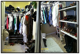
Here is a little before picture of what our closet looked like:


Ya know...not awful, but not great at all. You can see that I tried to organize my shoes using those cheap shoe organizers from Target. They just didn't work for me.

Do you see where my boots are to the right?? Well I had a space that was 12 inches deep, 31 inches wide and 96 inches tall. I knew I needed to use this space more efficiently and that is when Home Depot came to my rescue......


Can you hear the Angels going "Ahhh...."? Well I did!


I grabbed my measuring tape and decided to get 6 shelves, 3 tracks and 18 brackets. Then I ran home..well actually I drove, in my car..as fast as I could!


I cleared out that little nook where the shoe rack had been and began taping off the trim for a little fun paint. I can never leave well enough alone can I!? But I am loving the back drop to my shelves. Urban Bronze by Sherwin Williams baby!


I then decided that I needed even more bling and began spray painting all of the tracks and brackets Metallic Gold! 


Can I tell you how much I love my new Rustoleum Comfort Grip Sprayer! It saves your index finger from exhaustion and really helps create smooth lines. If you don't have one and you are a DIYer...it is a MUST! Not sure how I have been living without it all these years. Seriously!


Anyhoo..back to our project. Once all of the tracks were dry I started installing them using my drill and my muscles! HA!


Not too shabby! Then I started adding the brackets and shelves...


Totally Crushing on the gold details!!


After putting the shelves up I decided that they hung over just a little too far. Just about 3 inches too far. I was afraid that we might bump into them and then all of my shoes would go flying...which would equal no good.


So my dad helped me by measuring the three inches and using a level to make a straight line across the board. I was not going to go near the electric saw, so my dad came to the rescue of cutting all six boards for me. (I know I need to learn for myself one day!)


I took these babies home and sanded down the ends and placed them back up on their brackets.

THEN..came the fun part! Styling the shelves with my shoe collection!


As you can see we started the track and first shelf about 2 feet up so I could have room for my tall boots. Also, the top shelves that will be hard for me to reach ( I am 5'1") are shoes that aren't used all that much. I figured I could rotate the shoes based on the seasons as well! I also have so much room that I could add a few more shelves and actually store the Hubs shoes on there too. 
(We will see about that...how about just more shoes for me!...kidding/not kidding)


I also saved some major space by adding this little basket for all of my flip flops and thong sandals. 


I am In Love!!


This closet is still not Perfect, but SOOO much better already! Next task is to organize the clothes on the top shelf! I have an idea..so stay tuned.


What do you all think? Could you tackle a weekend project like this?

Thank you to The Home Depot for having amazing supplies and employees who are helpful!

Linked up at: We Heart Organizing & Thrifty Decor Chick

Monday, August 19, 2013

Industrial Lighting for Less

Hello There! Welcome to a new week! Can't believe it is Monday already....summer is flying by.


Last week I received a call from a friend that was in the market for some industrial lighting for her bedroom. She wanted two bedside table lamps that weren't outrageously priced. As we all know, lighting is expensive. Lighting is the one thing that you can really splurge on. It can change the look of each room in your home. That being said....you can find lighting that looks high end but serves the same function for less!


Take a look at the brass apothecary table lamp. I love the look of the brass throughout this room. It adds a little history to the space without making it feel antique and outdated. 


I also love the look of these swing arm bedside lamps. If you live in an apartment or have a really small bedroom where you need your bedside table for storage, these would be a great alternative. 

Let's take a look at where you can find these amazing Industrial lamps for under $100. 

One: This is a more modern take on the apothecary lamp. It would be a neat addition to even an office to give it a bit of glam. I also love how the lamp has a plug built right in for charging a cell phone or alarm clock.

Two: This lamp originally caught my eye because of the price. It is only $35.00 at The Home Depot. My friend really wanted a brass or shiny gold lamp, but for this unbelievable price...if you are a DIYer, you could buy a can of metallic spray paint for $3.00 and you still have an amazing lamp for an amazing price!

Three: Can you ever go wrong with items from World Market? This lamp has more of an upright feel, but still gives them same look. 

Four: I believe this beauty is the one my friend went with for her bedroom. This table lamp has so many color options that you could have one for each room in your home!

Five: Okay...I may have broke the $100 rule on this one, but I couldn't help it. I really like the idea of a swing arm lamp that hangs from the wall. You still get the same look, but these lamps help keep your bedside tables clear and allow more room for books and pretty items.


Would you consider putting these pretties in your home? How do you feel about splurging on lighting for your space?

Have a Marvelous week my friends!


Friday, August 16, 2013

Fabulous Feature Friday {Honey We're Home}

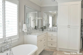
Happy Happy Friday! I have another great feature for you all today! My friend Megan from Honey We're Home just built her house a couple of years ago. She has really made her house a home by adding her own touches and DIYing many items throughout each space. Megan is also a very fit and healthy lady who writes Honey We're Healthy. Make sure you stop by and say hello!

Take a look at her beautiful home:


Loving the painted cabinets that make her white dishes pop! Megan and I both have an obsession for Urban Bronze by Sherwin William!


She is a styling queen! Take a look at those amazing built ins also painted Urban Bronze!


This is one amazing mudroom. I would love to have an entryway with so much storage!


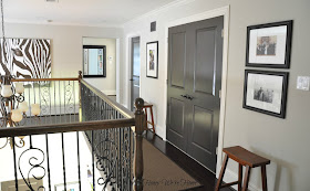
Megan recently painted her doors dark gray. Head on over to see the transformation
She sure has inspired me. 


Okay....I saved the best for last. Her "Mom Cave" AKA her walk in closet!! Ah-mazing!


What a beautiful place! Thanks Megan for sharing your home with all of us today! Lots of great eye candy!


Have a fabulous weekend my loves!


Thursday, August 15, 2013

Top 5 Design Mistakes {Number Two}

Last week we started this series by talking about Design Mistake Number One: Too Much of a Good Thing. This was referring to matchy matchy furniture. If you are guilty hop on over and see how you could change your decorating mistakes.


This week we are talking about Design Mistake Number Two: Lost in Space.

This refers to artwork throughout your home. Do you ever feel the need to put a picture on a wall just because you have an empty spot? I was also guilty of this in the past. Just know that you don't have to have artwork or pictures on every wall of your home.
Take a look at the picture above. There are exactly two pieces of artwork in this large space. They may be meaningful pieces, but don't make an impact at all because they are lost in the space around them.

Below are a few more examples of what NOT to do. {Since we are realtors in the Raleigh area I found these on our local listing site. If you live in or around Raleigh and these are pictures of your home...I apologize! Don't want to diss...Just want to educate others!}


This is obviously a beautiful home and probably staged by a professional, but could we get some larger artwork please!? I do like the fact they were trying for a group of pictures, but in order to make a bigger impact the pictures need to be larger in scale.


There is a lot going on in this family room, but notice the focal wall? A TV with three iron work circles above. Since this is the main focus when you walk into the room, it NEEDS to be the focus. How about some artwork framing the TV so it doesn't stand out?

Let's talk about what you can do to your spaces to spice it up a little with artwork.

Two things to remember about artwork:
1. It needs to work to scale
2. It should compliment your room


Now look at this focal wall! The TV is no longer the center of attention. It now blends into the gallery wall and becomes apart of the art. 


Here is another great example of scaled artwork. This large piece makes an impact and brings all of the colors together in Emily's living room. Notice this is the only artwork in this room. She didn't need to hang pictures on each wall since this gave her the wow factor for the whole space. 


Even though this focal wall only has one piece of art, it is well scaled to fit the wall where the console table is positioned. It also gives some air around the picture so your eye can settle on all of the textured pieces around the room. 


I love this example of artwork to scale, but also how it compliments the room. I think one of the best options if you need to fill a large space is a gallery wall. Whether it is a symmetrical gallery wall or a combination of sizes and colors...they are my favorite! There are so many great ideas on Pinterest and you can check out my whole board on gallery walls Here


So..are you guilty of artwork that is Lost in Space? or just hanging a picture any ole place just to find a place for it?

If you are stuck and not sure what direction to go with your artwork, email me some pictures of your space at eatsleepdecorate(at)gmail (dot)com.

Follow Along Here:

Monday, August 12, 2013

Picking Vanity Colors using {Small Wall}

While I was at Haven Conference I met Jenna from SAS Interiors. She is one talented blogger as well as interior designer/decorator. Jenna was able to come to the conference with the help of some fantastic sponsors. One sponsor that she was promoting was Small Wall. If you haven't used these before, then you will need some after I get done with this post! She was nice enough to give me a sample to try out!


How many times have you picked the wrong color for your room? Ummm.. I am right there with ya! These 12"x12" adhesive backed sample boards will really help with your color decisions. They are the perfect size where you can really sample the color and they have a sticky back that won't ruin your walls.


Here are the two samples that I am trying out for our Master Bath Vanity. You can see how I hung them right on the wall and the wood vanity. I could use these many more times without the adhesive wearing down.


Jenna told me you can paint over these samples and use them many times without having to get new ones.


This color is more true to the eye in the previous two pictures.


Aren't they great!? Now you don't have to have millions of paint samples on your walls. (You can thank me later...and your welcome!)

What color are you leaning toward for my vanity? Remember my inspiration picture HERE?

Any painting going on at your house?